Ichimoku swing trading system
Introduction
Welcome to the Ichimoku Swing Trading System guide. This guide aims to contribute meaningfully to your trading knowledge. To trade successfully is a journey; we hope this guide shortens your learning curve.
The Ichimoku Swing Trading System will teach you a specific method that is versatile and robust. Once you understand its structure, you may consider changing the parameters to suit your needs. We hope you not only enjoy learning the material but also find it extremely valuable and profit from it.
This guide is comprehensive. It uses the Ichimoku Cloud, also known as the Ichimoku Kinko Hyo (Ichimoku). Translated, this means "one glance equilibrium chart." The idea is that with one glance at the Ichimoku chart, you will have a good idea of market conditions. We must point out that if this is the first time you are looking at an Ichimoku chart, it will look very "busy", with lots of lines all over the place. We understand that this may be daunting. Don't worry. This guide will explain everything you need to know to understand the chart and use the system.
It is worth noting that the Ichimoku cloud is complete, meaning that no other indicators are needed to use the system. As such, the guide only deals with the Ichimoku system. In effect, the system gives you information regarding trend direction, support and resistance, momentum and more.
The Ichimoku cloud
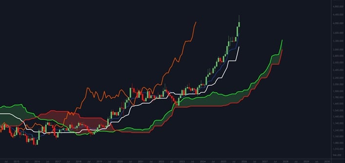
As you can see, the above chart has a lot going on in it. Therefore, we will break down and explain each part thoroughly so that you will know exactly how it fits together.
The Tenkan sen ( Conversion line )
In this chart, we have isolated the tenkan sen, also known as the conversion line. This component is the dotted blue line in the above chart. Its calculation is: (9-period high + 9-period low)/2. It is the midpoint of the 9-period high and 9-period low. Due to the period used in its calculation, the conversion line will be the fastest line of the Ichimoku. i.e. it will be the line most sensitive to price action and will turn first.
When the conversion line is moving up, it reflects a short-term uptrend; when it is moving down, the short-term trend is down. If it turns flat, it may indicate a change in direction. Price will also cross above or below the conversion line. When the price crosses from below the line to above it is bullish, and vice versa.
However, due to the sensitivity of the conversion line, these signals will result in too many whipsaws (false signals). As such, we do not give much importance to this line, which is why it is a dotted line and not a solid line.
The Kijun sen ( Base line )
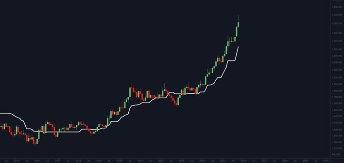
In this chart, we have isolated the kijun sen, also known as the base line. This part of the Ichimoku is the white line in the chart. Its calculation is: (26-period high + 26-period low)/2. It is the midpoint of the 26-period high and 26-period low. It is slower than the conversion line and tracks the price fairly well.
A strength of the base line is its ability to distinguish between pullbacks and trend reversals. For example, if the price pulls back but the base line remains flat, the move is likely a pullback instead of a reversal. However, if the base line changes direction, there may be an actual trend change.
Therefore, the direction of the base line is a confirmation of price direction, especially when the price crosses above or below it, i.e. a crossover without a directional change will question the validity of the crossover.
Its direction is essential to consider in trading.
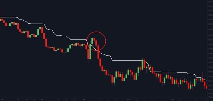
In this chart of Tradu's USDOLLAR basket, the price pulls back in April 2025 and then moves above the base line (red ellipse). However, note how the base line refused to follow the price upward. This resilience is an excellent example of the base line's power as the move was a pullback, not a trend change.
Unfortunately, the USDOLLAR began to decline shortly thereafter. The direction of the baseline is an integral part of the system.
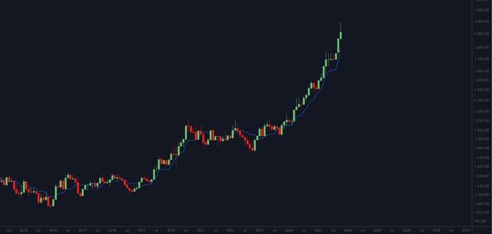
The Chikou sen ( Lagging span )
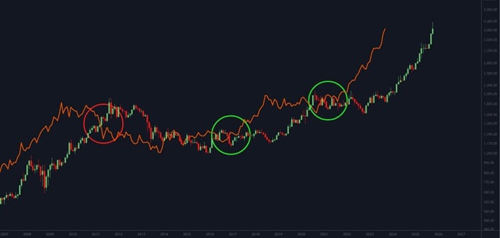
In this chart, we have isolated the chikou sen, also known as the lagging span. This line is the orange line in the chart. It is the current close plotted with a 26-period lag. If the chikou sen is above the price, it is bullish, and if it is below the price, it is bearish.
Above, you can see that in May 2011, the lagging span moves below price (red ellipse), and a price decline soon follows. In March 2017 and February 2021, it moved above price (green ellipses), and the price soon followed the lagging span upwards. We point out that the lagging span is not a timing tool as signals lag. For this reason, we only use the lagging span as a confirmation tool.
Senkou span ( Leading span A ) , Senkou span B ( Leading span B ) & the Cloud
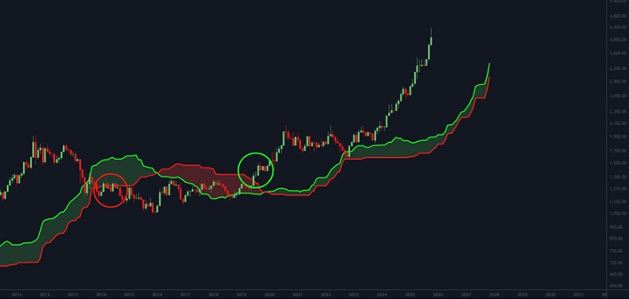
This chart includes the senkou span A (also known as the leading span A) and the senkou span B (also known as the leading span B). When they are combined, they form the cloud.
The leading span A is the green line in the chart and forms one of the cloud's boundaries. Its calculation is: (conversion line + baseline)/2, which is then adjusted so that it plots 26 periods into the future.
The leading span B is the red line in the chart and makes up the second boundary of the cloud. Its calculation is: (52-period high + 52-period low)/2, which also plots 26 periods into the future.
For example, the trend is up if the price breaks through resistance and moves above the cloud. Likewise, the trend is down if the price drops through support and moves below the cloud.
Therefore if the price crosses or is above the cloud, long trades are considered, and if the price crosses or is below the cloud, short trades are appropriate. The cloud is a crucial part of trading decisions.
In the chart, the price moved through the cloud in December 2013 (red ellipse), signalling a shift to a downtrend. Although the decline wasn't sharp, the price effectively stopped advancing for nearly seven years. Then, in June 2019 (green ellipse), the price broke above the cloud, indicating a return to a positive trend as the market began to recover. These types of signals help traders align their positions with the prevailing market direction.
Trending Markets vs Consolidations
Trending markets will move either up or down in an uptrend or downtrend. Consolidating markets move sideways. It is essential to know that the Ichimoku cloud has a bias towards trending markets. I.e. it is designed as a trend-following system. Sideways markets will generate false signals called whipsaws.
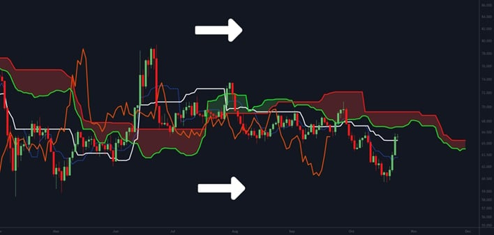
This chart is the daily timeframe of Brent (UKOil). It consolidated and moved sideways since April 2025 until the end of October 2025. In addition, the clouds were narrow in range, changing colour often. The white base line constantly whipsawed up and down, and the orange lagging span showed little preference. It is best to avoid this type of market and seek opportunities elsewhere, where the trend is more apparent.
Top -Down Analysis
There are several trends at work in a market at any given moment. Notably, the primary trend is the significant market move and will take months or even years to complete.
However, there will be much smaller movement within the primary trend in different time frames. The primary trend will significantly influence these smaller movements.
If the primary trend is up, we will target upswings in a lower time frame. This tactic is because the primary trend's influence will make the majority of upswings stronger than the downswings. Similarly, if the primary trend is down, it will influence short-term swings to the downside.

The line on the left's primary trend is up (green arrow). We can see that the upswings are broken intermittently by downswings. However, the primary trend influences the upswings, i.e. they are more prominent in amplitude or size.
Similarly, the line on the right's primary trend is down (red arrow). Again, there are interruptions by upswings, but the downswings are more dominant. As such, we will always seek to trade in the direction of the primary trend with this system.
The question is, how do we assess the direction of the primary trend? First, we use the daily Ichimoku cloud to give us directional bias. Then, once we have this, we will use a lower time frame Ichimoku chart to time our entries in the direction of the primary trend.
Daily Ichimoku cloud analysis
In this section, we will examine two case studies. The first is XAUUSD, and the second refers to the NZDUSD. We will show you step by step how the system works.
UPTREND - XAUUSD Daily Chart - CASE STUDY 1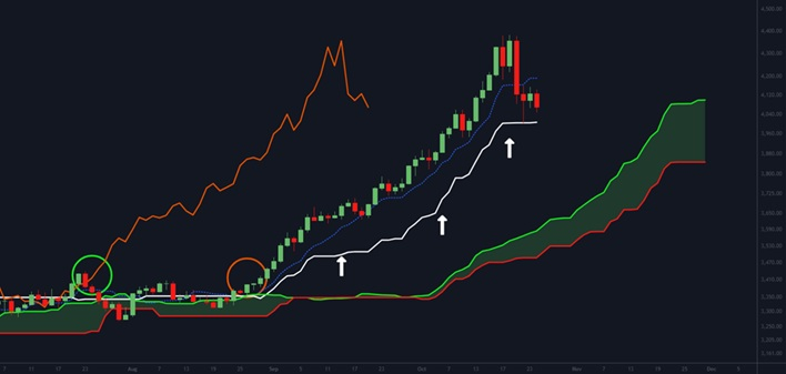
- The price crossed and is above the cloud (orange ellipses).
- The white base line is moving upwards (white arrows).
- The lagging span is above price (green ellipses).
- The forward cloud is light green.
Conclusion: The primary trend is up.
DOWNTREND - NZDUSD Daily Chart - CASE STUDY 2
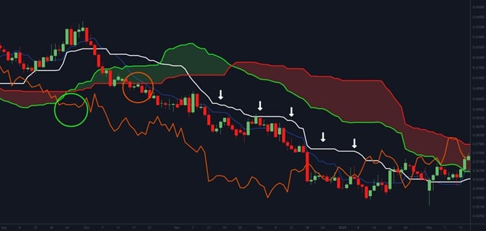
- The price crossed and is below the cloud (orange ellipse).
- The white base line is moving downwards (white arrows).
- The lagging span is below the cloud (green ellipses).
- The forward cloud is light pink.
Conclusion: The primary trend is down.
Hourly Ichimoku cloud analysis
LONG ENTRY AND EXIT - XAUUSD Hourly Chart - CASE STUDY 1
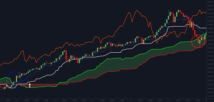
We know from the daily example above that the primary trend of XAUUSD is up. As such, the system looks to take a long position, i.e., we are trading with the trend. To this end, it aims to initiate an entry after a correction into support:
- XAUUSD crossed above the cloud on 10 October (blue ellipse).
- Then the white base line started moving up (white arrow).
- This direction bias is the point of entry for our long position.
- Significantly it is moving in the same direction as the primary trend as per the daily XAUUSD example above.
- The initial stop is placed just under the red leading span B.
- However, as the swing proceeds in the direction of the primary uptrend, we switch and use the green leading span A line as a trailing stop.
- Eventually, the price crosses the green leading Span A (red ellipse) a few days later (17 October 2025), and the exit triggers a gain of around 140 points.
SHORT ENTRY AND EXIT - NZDUSD Hourly Chart - CASE STUDY 2
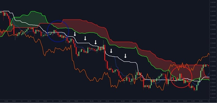
We know from the daily example above that the primary trend of the NZDUSD is down. As such, the system looks to take a short position, i.e. we are trading with the trend. To this end, it aims to initiate an entry after a correction into resistance:
- The NZDUSD pulled back into cloud resistance in November 2024 (blue ellipse).
- Once the price resumed its down move, the white base line started moving down (white arrows).
- This directional movement is the point of entry for our short position.
- Significantly it is moving in the same direction as the primary trend as per the daily NZDUSD example above.
- The initial stop is placed just above the red leading span B.
- However, as the swing proceeds in the direction of the primary downtrend, we switch and use the green leading span A line as a trailing stop.
- Eventually, the price crosses the green leading Span A (red ellipse), and the exit triggers on 18 November 2024 for a gain of around 100 pips.
Risk Management
This section is essential. Our presented method is excellent. However, there will be trades where the stop-loss is triggered, and you exit for a loss. These losses should be controlled losses.
The system advocates that no more than 1% to 2% of your trading account is at risk at any time. Our preference is 1%. This management means for a $5,000 account with a risk profile of 1%, the trade risk is $50.
As your account grows, the allowed lot size will increase, as the risk percentage determines. To make good returns in the market, you must protect your trading account. This rule ensures that, so be disciplined in applying it. It will protect your account, particularly when a string of losses is incurred.
Risk management is vital because when the method aligns with the market again, you will recover and move into profit quickly.
Final Note
We hope you found this guide informative and recognise the system's power when price trends gain momentum. You may feel a little overwhelmed, and that's ok. Start practising on a demo account until you get comfortable with the method.
Thank you for taking the time to read our Ichimoku Swing Trading System, and we wish you all success in your trading endeavours.
FXCM Research Team
FXCM Research Team consists of a number of FXCM's Market and Product Specialists.
Articles published by FXCM Research Team generally have numerous contributors and aim to provide general Educational and Informative content on Market News and Products.
Any opinions, news, research, analyses, prices, other information, or links to third-party sites contained on this website are provided on an "as-is" basis, as general market commentary and do not constitute investment advice. The market commentary has not been prepared in accordance with legal requirements designed to promote the independence of investment research, and it is therefore not subject to any prohibition on dealing ahead of dissemination. Although this commentary is not produced by an independent source, FXCM takes all sufficient steps to eliminate or prevent any conflicts of interests arising out of the production and dissemination of this communication. The employees of FXCM commit to acting in the clients' best interests and represent their views without misleading, deceiving, or otherwise impairing the clients' ability to make informed investment decisions. For more information about the FXCM's internal organizational and administrative arrangements for the prevention of conflicts, please refer to the Firms' Managing Conflicts Policy. Please ensure that you read and understand our Full Disclaimer and Liability provision concerning the foregoing Information, which can be accessed here.